Chapter 2:
Key Analyses and Results
That Inform Recommendations
COVID Impacts
As a basis for approaching comparison groups in the era of COVID, we must first understand the size, scope, and variability of these impacts and how they differ between customer segments. Therefore, as a first step of this effort we have measured the change in electricity consumption attributable to COVID for all meters in MCE’s service territory. To make this measurement we performed CalTRACK 2.0 hourly calculations for each meter using the following baseline and reporting period timeline:
As a basis for approaching comparison groups in the era of COVID, we must first understand the size, scope, and variability of these impacts and how they differ between customer segments. Therefore, as a first step of this effort we have measured the change in electricity consumption attributable to COVID for all meters in MCE’s service territory. To make this measurement we performed CalTRACK 2.0 hourly calculations for each meter using the following baseline and reporting period timeline:
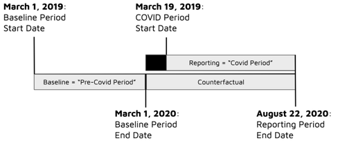
Figure 1: Metering timeline for the calculation of COVID impacts. This timeline is used for many of the comparison group tests described throughout this document.
March 19 is chosen as the COVID-period “start date” because on that date California entered a state-mandated stay-at-home order, which has remained in place to varying degrees since. The baseline period has been chosen as the 366 days leading to March 1, 2020. With this timeline, the COVID shutdown is essentially treated as though it were a program intervention in a typical meter-based savings calculation for a demand-side program. The baseline period model, developed from a year of “pre-COVID” data, is projected forward as the counterfactual into the COVID period and associated impacts are determined for each meter by comparing observed usage to the counterfactual predicted usage. The CalTRACK methods account for temperature and these calculations are thus weather-normalized.
We note that in both existing and future programs, the impacts of COVID may be entirely or predominantly in the baseline period, reporting period, or could be in both. While it is not feasible to extensively test each of these scenarios, the metering timeline of Figure 1 provides a clean view into a relevant yet limiting case in which the entirety of the baseline period is not affected by COVID while the reporting period contains what is anticipated to contain the most severe COVID impacts.
In order to enable clear outcomes we will focus only on non-solar meters for all analyses throughout this work.
Residential Sector
Looking first at the Residential sector, Figure 2 shows the observed and counterfactual daily load shape for an average meter.
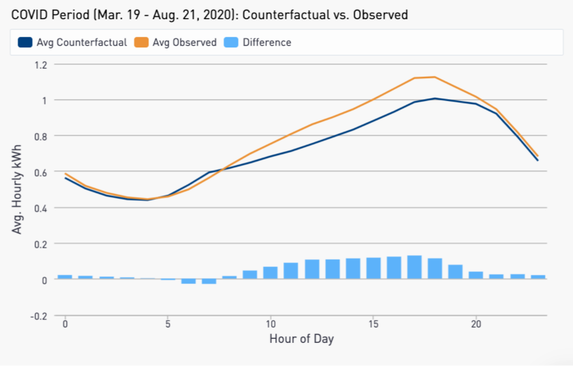
Figure 2: Average observed and counterfactual daily load shapes for MCE non-solar Residential customers during the COVID period.
We measure a total increase in consumption of 7.9% due to COVID, with the majority of this increase occurring in the mid-day hours. These results are intuitive given that many customers who would have been away at work have needed to stay home.
While the average customer experienced an increase in usage, we observe a wide distribution in COVID impacts at an individual customer level. Figure 3 shows the distribution of COVID impacts across the residential sector.
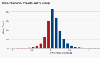
Figure 3. Distribution of the percent change in electricity consumption due to COVID for MCE non-solar Residential customers.
Despite the wide spectrum of COVID impacts among individual Residential customers, we have observed relatively little change in this distribution among different demographic segments of the population, including when isolating particular geographic locations and assessing the low-income sector. In addition, the distribution of Figure 3 is largely stable against different usage characteristics that we have tested. More detailed COVID impacts results for the Residential sector can be found in Chapter 5 and Appendix B.
Commercial Sector
Figure 4 shows the average observed and counterfactual daily load shapes for non-solar Commercial customers in MCE territory. A 15% overall reduction in electricity consumption is observed.
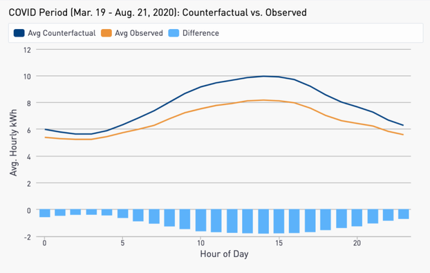
Figure 4: Average observed and counterfactual daily load shapes for MCE non-solar Commercial customers during the COVID period.
As in the Residential sector, the largest difference is seen in the middle of the day where most businesses have typical operating hours.
In assessing COVID impacts in the Residential and Commercial sectors, we observe an additional commonality and one important difference that has implications for comparison groups:
As an example, Figure 5 shows distributions of COVID impacts for Grocery and Convenience stores (left) and Hotels and Lodging facilities (right).
As in the Residential sector, the largest difference is seen in the middle of the day where most businesses have typical operating hours.
In assessing COVID impacts in the Residential and Commercial sectors, we observe an additional commonality and one important difference that has implications for comparison groups:
- As with Residential, a wide distribution of COVID impacts exists at an individual customer level among different businesses.
- Unlike Residential, we observe that different segments of the Commercial sector exhibit widely different responses to COVID.
As an example, Figure 5 shows distributions of COVID impacts for Grocery and Convenience stores (left) and Hotels and Lodging facilities (right).
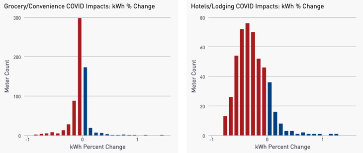
Figure 5: Distribution of the percent change in electricity consumption due to COVID for Grocery and Convenience stores (left) and Hotels and Lodging facilities (right).
While the Grocery/Convenience stores have seen an 8% decrease in consumption, the business operations of Hotels appear to have been far more impacted with a 24% drop in electricity usage. While these are just two examples, across the distinct economic segments of the Commercial sector we observe a wide range of COVID impacts (full results in Table 1 below).
If creating a comparison group that is blind to business type, savings calculations are likely to be subject to significant error on account of differing responses to COVID. Figure 6 shows how this effect plays out for the same segments: Grocery/Convenience (top) and Hotels/Lodging (bottom). This figure shows the results of difference of differences calculations when taking samples from these subsectors as a “treatment” group and utilizing a random sample of commercial customers as a comparison group. The vertical dotted line indicates March 19, the start of the COVID period. At this point, the random sample does not effectively mirror the response to COVID unique to these business types and the effects are observed as residuals that are consistently low (Grocery/Convenience) or high (Hotels/Lodging).
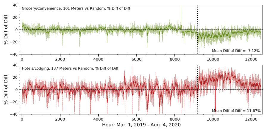
Figure 6: Difference of differences calculations throughout the baseline and COVID periods for the Grocery/Convenience segment vs. a random sample of commercial customers (top) and the Hotels/Lodging sector vs. a random sample of commercial meters (bottom). The dotted line indicates the start of the COVID period.
As detailed in Chapter 6/Appendix C, with data on business type, comparison groups can be formed that are capable of neutralizing the large between-segment differences observed in the Commercial sector. However, where business type information is not available other strategies must be employed, either on the measurement or program side, to ensure reliable measurement can be made to appropriately account for COVID impacts within meter-based Commercial programs.
One such M&V approach would be to identify usage characteristics observable in a baseline period that are predictive of customer responses to COVID. For instance, it may be that customers with higher total baseline period usage tend to be impacted less by COVID. However, as detailed in Table 6, we have been unable at this point to find particular consumption characteristics that are adequately predictive of COVID impacts to eliminate the business type differences we observe.
Comparison Group Sample Size
A foundational element of comparison group selection is the proper sizing of the sample. If a sample is too small it will introduce undue uncertainty into the savings calculation simply by random noise effects. However, if a sample is larger than actually needed, program administrators may release more non-participant records than is justified, the comparison group may have to be made less representative of a treatment group, and computational costs will be higher than necessary.
To gauge the degree to which random variability in comparison group selection can produce uncertainty in the calculation of savings, we performed the following analysis for the Residential sector:
Because both the treatment group and the comparison pool are selected at random from MCE’s customer base, the expected value of these differences is 0 and residuals are attributable to random variation. Figure 7 shows the results of this analysis for a baseline CalTRACK model.
A foundational element of comparison group selection is the proper sizing of the sample. If a sample is too small it will introduce undue uncertainty into the savings calculation simply by random noise effects. However, if a sample is larger than actually needed, program administrators may release more non-participant records than is justified, the comparison group may have to be made less representative of a treatment group, and computational costs will be higher than necessary.
To gauge the degree to which random variability in comparison group selection can produce uncertainty in the calculation of savings, we performed the following analysis for the Residential sector:
- Compiled two non-overlapping random samples of 50,000 MCE residential meters
- Performed CalTRACK 2.0 Hourly calculations using the metering timeline of Figure 1 for each meter.
- The first of the random samples are taken as the “treatment” group. The second random sample is taken as a comparison pool.
- From the comparison pool 50 random samples each are pulled for sample sizes of 100, 250, 500, 1000, 3000, and 10000 meters, respectively.
- Differences between the treatment group and comparison samples are calculated on the bases of pre-COVID observed kWh, pre-COVID model kWh, COVID period observed kWh, and COVID period counterfactual.
Because both the treatment group and the comparison pool are selected at random from MCE’s customer base, the expected value of these differences is 0 and residuals are attributable to random variation. Figure 7 shows the results of this analysis for a baseline CalTRACK model.
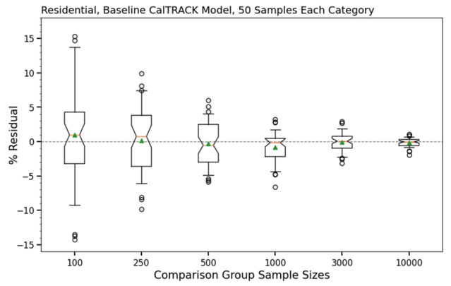
Figure 7: Box and whisker plot showing the distribution of residual error introduced by different comparison group sample sizes for Residential customers in MCE’s service territory. Each box represents the interquartile range and the whiskers represent the 0.05 - 0.95 probability range. Outliers are shown as individual data points outside the whiskers. The mean for each sample size is shown as a green triangle, the median an orange bar, and the notch is set to show the 95% confidence interval of the mean.
The results of Figure 7 imply that comparison group sample sizes of 500 or less in the residential sector are prone to introducing uncertainty on the order of 5% or more. Sample sizes of 3,000 or more are capable of reducing uncertainty to +/- 2% in the vast majority of cases and yet larger samples reduce variance to an even greater degree.
As the next step in this analysis we investigated each element that feeds into a difference of differences (savings) calculation. Results are given in Figure 8 for the 3,000-meter sample size.
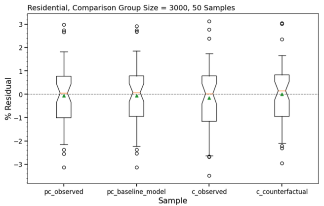
Figure 8: Box and whisker plot showing the variability present across each component of the difference of differences calculation for the 3000 sample size.
Figure 8 shows a high degree of consistency between the various elements of the difference of differences calculation. In both pre-COVID and COVID periods, nearly the same degree of variability is apparent between observed and modeled components. This is the case for all sample sizes investigated.
Given these results, we recommend a comparison group size of at least 3,000 meters for most Residential programs. Fewer meters may be appropriate for deep retrofit programs expected to deliver more than 15% savings, while programs expecting under 5% savings may require larger groups. As noted above, larger comparison groups generally necessitate larger comparison pools to produce the same quality match to a given treatment group.
For Commercial sector programs the number of comparison group meters needed for an appropriate level of uncertainty will depend on the targeted segment(s). Some business types tend to have far more stable, consistent, and predictable usage patterns while others have a higher degree of diversity and variation in energy usage between customers, which leads to the need for both larger treatment and comparison groups to achieve the desired level of measurement precision. While it is beyond the scope of this work to conduct a detailed assessment of variability within every commercial subsector, we have conducted tests that can lend a foothold to the question of sample size.
Table 1 gives results for tests in which the available meters within each commercial segment are split evenly with the resulting samples compared against one another. For each NAICS group the sample sizes are listed. The % Diff columns show the percentage difference for each sample between the CalTRACK prediction and the observed value for total consumption in both the pre-COVID (baseline) and COVID (counterfactual) periods. The discrepancy observed between samples for each subsector is shown in the “Sample 1 - Sample 2” columns.
Table 1
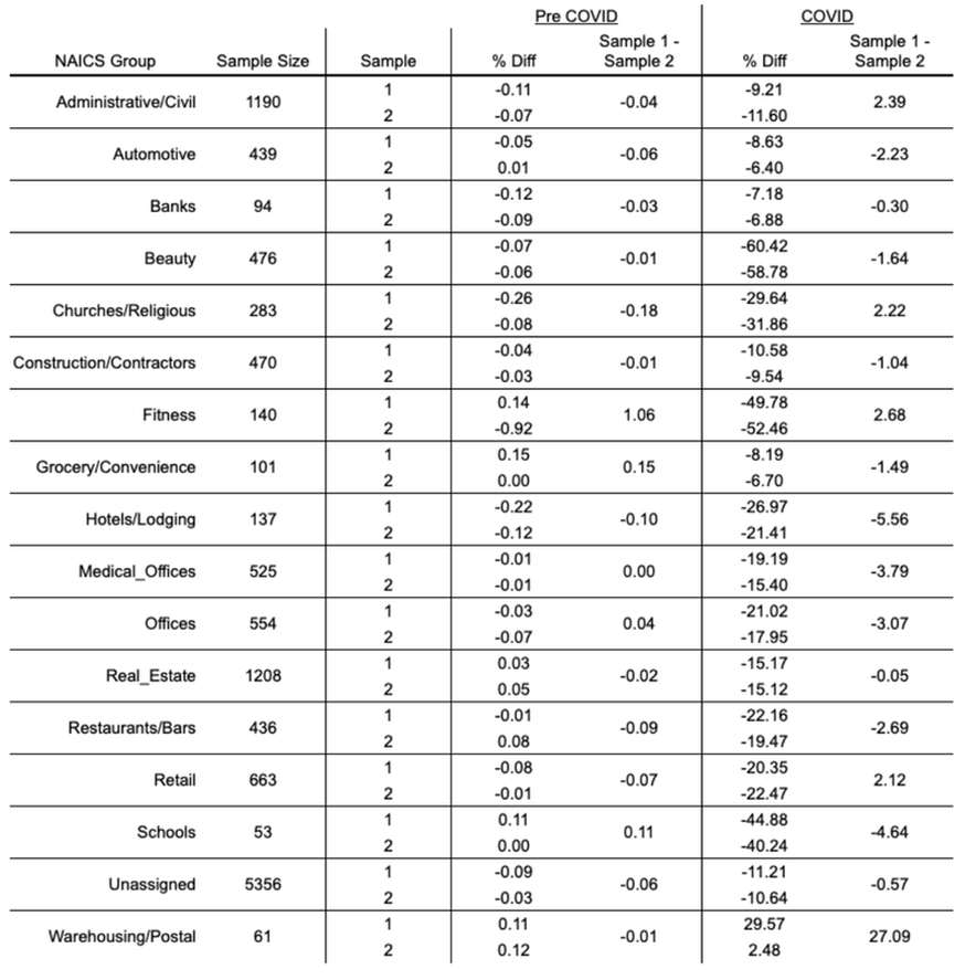
All subsectors show minimal divergence in the baseline period. Most subsectors exhibit a discrepancy of under 3% during the COVID period. For 16 of the 17 subsectors this value is under 6%. While some of this could be luck of the draw as we are only taking one arrangement of each sampling split, the low discrepancies, even with most sample sizes well under 1,000 meters, indicate that with business type information reliable comparison groups can be formulated for the commercial sector.
Instead of issuing a formal recommendation on sample size for all subsegments of the Commercial sector we provide the following consideration: Most jurisdictions have relatively few Commercial meters relative to Residential accounts, and the number of meters available for any particular economic segment is likely to be very limited. To facilitate reliable comparison group formulation, utilizing all non-participating meters that correspond to a program’s participant group would provide the most statistical power possible for measurement during the COVID era. Clearly, any customer pulled into the program should be tracked accordingly and removed from the comparison group.
Hourly Measurements
The reliable measurement of load impacts on an hourly basis is critical for many modern demand flexibility programs. In addition, programs are becoming more targeted, where customers with particular usage characteristics, like high cooling loads or peaking load profiles, offer an opportunity to enhance the cost-effectiveness and scalability of demand-side programs. With these trends in mind, we have assessed the sensitivity of hourly measurements to a comparison group.
Figure 9 gives an example of an hourly difference of differences calculation in which the “treatment” group consists of 3,000 meters that exhibit a shallow evening ramp. The top plot shows results when this sample is tested against a random sample of residential customers. The bottom plot gives results when the comparison group is pulled from customers with similar load profiles.
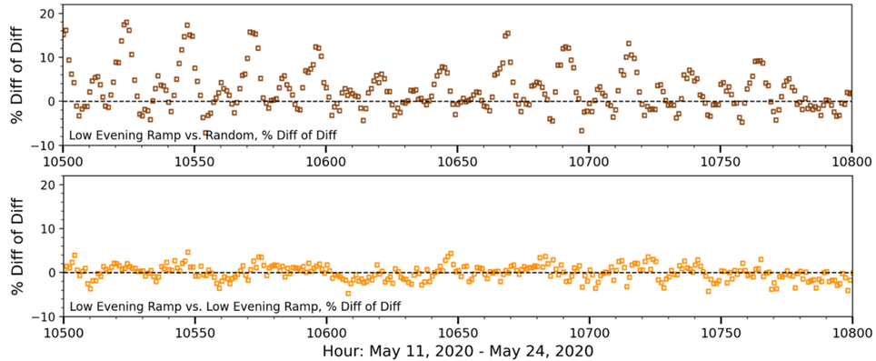
Figure 9: Residuals in a difference of differences calculation. Top - sample of residential meters with low evening ramp vs. a random sample of residential customers. Bottom - sample of residential meters with low evening ramp vs. a sample of residential customers that have similar load characteristics.
Importantly, the comparison group of randomly selected customers leads not only to higher variability in the COVID-period residuals, but these residuals exhibit a regular pattern of peaks every 24 hours that would introduce upwards of 20% error in a load shape measurement relative to total usage. As a result of these and similar findings across several other trials detailed in Chapter 5 and Appendix B, random sampling should not be considered sufficient for the measurement of hourly load impacts. We revisit this topic in Chapter 3.
Importantly, the comparison group of randomly selected customers leads not only to higher variability in the COVID-period residuals, but these residuals exhibit a regular pattern of peaks every 24 hours that would introduce upwards of 20% error in a load shape measurement relative to total usage. As a result of these and similar findings across several other trials detailed in Chapter 5 and Appendix B, random sampling should not be considered sufficient for the measurement of hourly load impacts. We revisit this topic in Chapter 3.